
Hindustan Times
UX audit | HT News App | Media
Conducted a comprehensive UX audit and user research to ensure optimal user experience, including competitive benchmarking, user flows, wireframing, and visual journeys for HT News App. I also designed the new Hindustan Times responsive website based on the users need analysis, live since December 2020.
Introduction
A UX audit is a process used to identify potential usability issues in the existing solution/product based on the heuristic principles & prior user research.
Objectives
1. To identify and uncover the root problems which hamper the experience of HT App users.
2. To improve the overall satisfaction of users while interacting with the HT App.
UX Audit findings would help us to built an app, in alignment with business goals.
It focuses upon:
Retention
We lose ~60% users after the first week. Understanding the right problems helps to build the right solution. This would bring down user churning.
Increased session time
Average session time was only 5min 30s for the running app. We can help users in increase the consumption and extend
the time spent on app by providing better visibility of features.
Increase in DAU and MAU
Existing DAU were 22k and MAU were 120K.
Methodology
01
Heuristic Evaluation
• Usability Principles
• How to Conduct
• Heuristic Issues
02
User Research (UCA)
• User Interviews
• User Insights
• Persona
• User Journey
03
Competitive Analysis
• Competitors
• Perceptual Mapping
• Testing Parameters
• Insights
04
Design
Proposal
Proposed user journey and wireframes
Heuristic Evaluation
01
What is Heuristic Evaluation?
According to renowned usability expert Jakob Nielsen, “heuristic evaluation involves having a small set of evaluators examine the interface and judge its compliance with recognised usability principles (the ‘heuristics’)”.
How to conduct it?
When conducting a heuristic evaluation, evaluators compare a predefined set of specific usability principles with a product, app or website interface while attempting to accomplish actual system tasks.
Heuristic issues in the current app
PRE-LOGIN HOME

Heuristic Violated
• User control & freedom
• Error prevention
Issues
• Not enough engaging info (related to news)
• Too much distraction because of multiple ads
• Discoverability & findability issues for specific news
• Inconsistent usage of colors for styling. Cyan color theme broken by other color use
• Rounded corners and straight corners mismatch among widgets and other items
Recommendations
• It is very important to bring user’s attention towards NEWS followed by reading the article. Not being able to find the sufficient news info can possibly disappoint the user.
• Reduce the cluttering
• Give a bit more freedom to search by keywords
QUICK READS

Heuristic Violated
Match between system & the real world
Issues
• User might be interested in knowing the age of the news/article, this would make user
decide to read it further or not
• ‘quickreads’ looks like some jargon maybe because of no space between quick & reads
• Inconsistent usage of capital case and lower case for headings
• User expects to goto home after tapping ‘Hindustan Times’ logo
Recommendations
• Use texts that are easily understood by the users
• If user is actively reading articles here, then header & sections could hide for a time being
giving more space for image & news
• Add link to home screen on logo
LOGIN
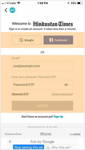
Heuristic Violated
• Consistency & Standard
• Help users recognise, diagnose, and recover from errors
Issues
• Google & Facebook button don’t depict their purpose. Would be difficult for a novice user to
understand it.
• Facebook button looks more prominent than Google’s
• Hint text used in Email ID/ Password look like actual text
• One is ‘Email’ & another is ‘Enter your password’ both labels are inconsistent
• So many terms for similar actions on this screen (Sign Up, Signin, Create an account)
• Accommodating ‘Generate OTP’ & ‘Forgot Password’ are placed at same hierarchy level.
This might increase the cognitive load to the users.
• This has no 'Back button' to take user back to previous page (android journey)
Recommendations
• Follow same & standard labels
• Explain the purpose of this screen clearly & show the options clearly. It’s just about signin &
signup.
STORY PAGE

Heuristic Violated
• Aesthetics & Minimalism(Gestalt’s properties)
• Navigation
Issues
• Share button on top and before image is redundant
• Advertisements have no distinction with story without margin
• Margins between paragraphs, advertisement and listings
don't follow margins to given enough distinction
• User expects to go back to previous story after tapping of
back button if user were reading another story before
Recommendations
• Remove one share button
• Search should be adapted on homepage
Note : Only a few key screens are shown here. However, the detailed analysis of all screens was conducted & taken into the consideration.
Takeaways from design audit
• Major violations in Aesthetics and Minimalism which has to be solved
• Layout and elements within has to be standardised
• Need to modify the navigation
.jpg)
.jpg)
02
User Research
User analysis interviews
Sample size : 24
Age group : 20 - 45
Professionals | Entrepreneurs | Students | UPSC Aspirant
Interviews were done among mixed group of men and women, married and unmarried from Tier 1 and 2 cities.
Commonly used mediums were, Inshorts, Google News, Hindu and TOI.
Users' Voice


User Persona

User Patterns
Pattern 1

Pattern 2
Experience Pitfalls
Problem finding processes to uncover the gaps between user expectations and current app.


Competitive Analysis
03

Perceptual Mapping

Benchmarking Parameters

Takeaways from competitive research

Re-design
04
Explored what could be done to alleviate the problems found in the exercise and how it might be solved using design. Revised app interface was proposed which would facilitate a better user experience.
ONBOARDING

Assisted Journey
• Use minimum screens to introduce features and help user understand features required
• Unfamiliar features can be introduced to users with crisp and minimal text
HOME

Minimal Layout
• Follow optimum use of white space and provide more breathing space. Proximity to ads need to be managed so that it would not be intrusive
• Weight and scale of text should follow a regular visual hierarchy to enhance the aesthetics
STORY PAGE

Minimum Info First
• All controls can be made available on tap/swipe.
• Add smartphone centric shortcuts like swipe-left to save/share
OTHER STORIES

Recommend & Motivate
• Suggest users stories to read and help them consume more with ‘Tags’ and similar stories
• Allow users to follow authors they like and provide describing text
PERSONALISATION

Personalise the experience
Allow users to choose and follow news they like, and extend personalization to select notifications they get• Allow users to follow authors they like and provide describing text
SHORTS

Play with different formats
Show news in different formats to avoid monotonicity.

Thanks for your time!